How to Build a KPI Dashboard in Excel From Scratch (Step-by-Step)
VKVIKASH KUMAR JAIN · July 24, 2026 · 4 min read
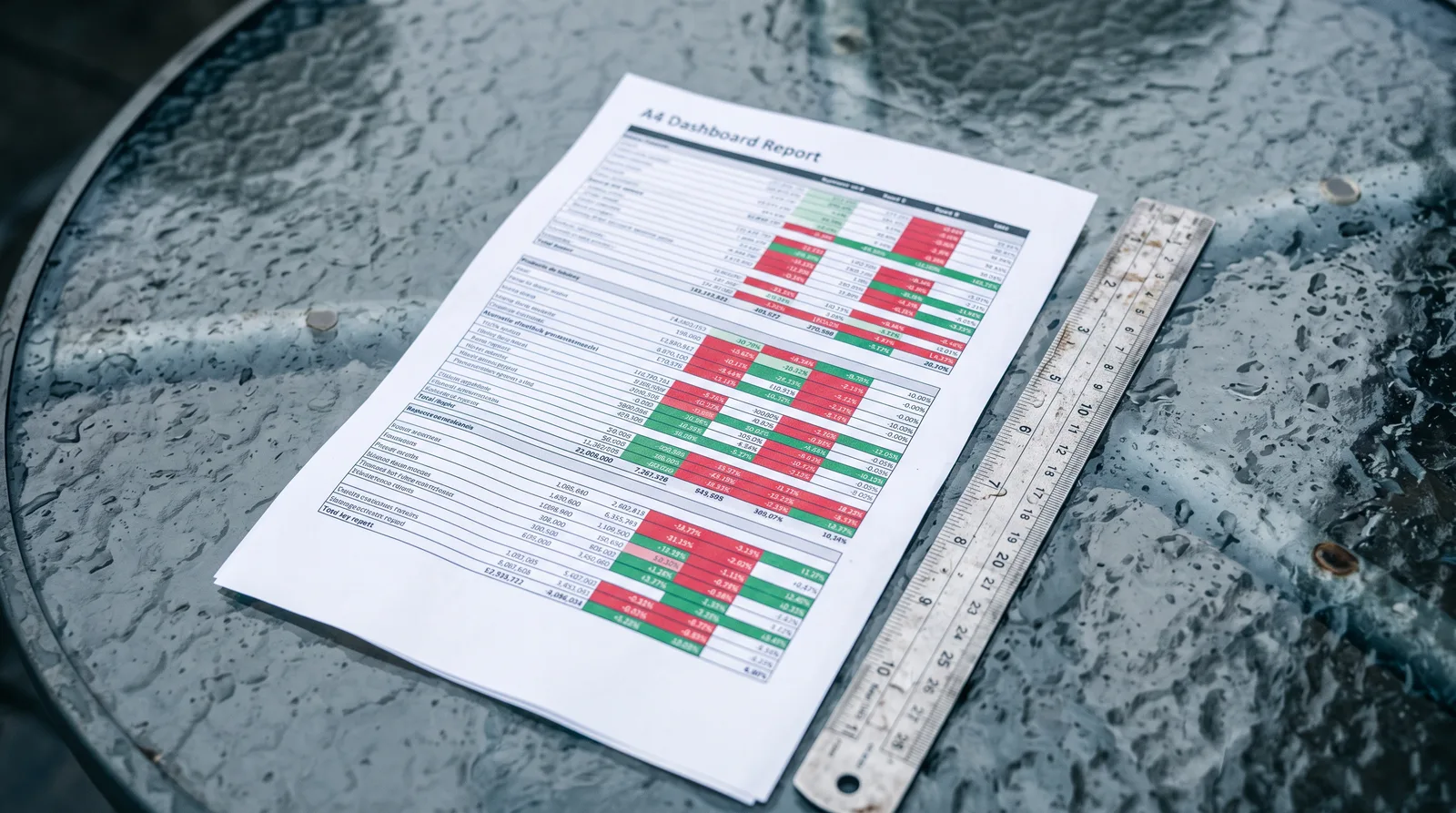
Most "dashboards" I see are just tables with a color scheme slapped on top. Rows of numbers, a few bar charts floating around, and a title that says "Monthly Report." A CFO glances at it, feels nothing, and asks for the summary in an email instead.
That's not a dashboard problem. That's a design and thinking problem — and fixing it doesn't require Power BI, Tableau, or any fancy software. Excel is enough. What you actually need is a clear process. Here it is.
Step 1: Choose KPIs That Drive Decisions (Not Just Data You Have)
Before you open Excel, answer one question: What decisions does this report need to support?
If the report is for a sales leader, they need to act on pipeline health, conversion rates, and revenue vs. target. If it's for a CFO, they care about gross margin, cash flow, and variance to budget. Pick four to eight KPIs maximum. A dashboard with twenty metrics tells the reader nothing — every number competes for attention equally.
A useful test: for each KPI you're considering, ask "If this number is red, what would we do differently?" If you can't answer that, cut it.
Step 2: Structure Your Raw Data Correctly
Your dashboard needs a clean data source to pull from. Set up a separate tab — call it DATA — and follow these rules:
- One row per record. Don't merge cells. Don't put totals mid-table. Excel's formulas and pivot tables hate that.
- Use consistent date formats. Pick one format (e.g.,
MM/DD/YYYY) and stick to it throughout the whole column. - Label every column with a plain header. No merged header rows spanning three columns. Each column gets its own single-cell label in Row 1.
- No blank rows between data. A blank row tells Excel the table ended.
Think of this tab as your database. You'll never format it. You'll never print it. It just holds truth.
Step 3: Build a Summary Tab With Formulas
Add a second tab — call it SUMMARY — and use SUMIFS, AVERAGEIFS, and COUNTIFS to calculate each KPI from the raw data. For example:
=SUMIFS(DATA!C:C, DATA!A:A, "January", DATA!B:B, "North")
This pulls total sales for January in the North region without you touching the data tab. When the data updates, your summary updates automatically.
Build one row per KPI, with columns for: Actual, Target, and Variance (Actual minus Target, or as a percentage). That variance column is where the story lives.
Step 4: Design the One-Page Dashboard Tab
Create a third tab — DASHBOARD — and treat it like a page layout, not a spreadsheet. Here's the structure that works:
Top strip: Company name, report period, and date last updated. Three cells. Clean.
KPI scorecards (left column or top row): For each key metric, show the actual value, the target, and a variance indicator. Use a simple IF formula with Excel's conditional formatting to make the variance cell green (on target) or red (off target). Avoid traffic-light icons that are too small to read at a glance — a colored cell background is clearer.
Charts (center and right): Two or three charts maximum. A column chart showing monthly actuals vs. target works for revenue. A line chart works for trends over time. Keep chart titles as plain statements: "Revenue vs. Target — YTD" not "Chart 1."
One commentary box (bottom): A text box with three lines: what's working, what's at risk, and what action is recommended. This is the part most people skip — and it's the part a CFO reads first.
Step 5: Lock the Layout and Remove the Grid
Once everything is placed, do three things:
- Go to View → Show → uncheck Gridlines. The dashboard should look like a document, not a spreadsheet.
- Set the zoom to 100% and check that everything fits on one screen without scrolling.
- Protect the
DASHBOARDandSUMMARYtabs (Review → Protect Sheet) so that nobody accidentally breaks a formula. Leave theDATAtab unprotected so the team can update it.
Print preview it. If it fits on one landscape page and you can read every number without squinting, you've done it right.
The Principle Behind the Process
A good KPI dashboard doesn't show everything — it shows the right things, in the right order, with the variance and the so-what already answered. The three-tab structure (Data, Summary, Dashboard) keeps your logic clean and your presentation sharp. Mess up that separation and you'll be rebuilding from scratch every month.
This is the foundation I teach inside MIS Report Mastery — but you can build your first working version today with exactly the steps above. Get it in front of one decision-maker, watch how they interact with it, and refine from there. The best dashboard is always the one that actually gets used.

Want to go deeper than a blog post?
MIS Report Mastery
Learn to build KPI-driven management reports that expose variances, explain performance clearly, and give decision-makers exactly what they need to act with confidence.
Start learning — $59/mo